Competitor Comparison Pages That Convert Mid-Funnel Buyers
Comparison pages convert five times better than blog posts despite driving one-fifth the traffic.

Only about 14% of marketers actively create bottom-of-funnel content. Meanwhile, roughly half focus primarily on top-of-funnel. So the typical content program spends the vast majority of its energy attracting people who are browsing and almost nothing converting people who are actually buying.
That's not a messaging problem. It's an allocation problem.
And honestly, it makes a weird kind of sense when you think about how content teams get evaluated. Traffic is easy to report. Demo requests from a comparison page are harder to attribute. So the metrics push teams toward volume, toward the big blog post targeting "what is [category]," and away from the page that a buyer three weeks from signing would actually find useful.
Full-funnel strategies that include bottom-of-funnel content consistently deliver better ROI than single-stage approaches. High-performing teams put roughly 40% toward top-of-funnel, 35% toward mid-funnel, and about 25% toward bottom. That last number sounds small. The pipeline impact is not.
Comparison pages are the highest-leverage underinvestment in most B2B content programs. If your content is generating traffic but struggling to show pipeline, this is usually the reason.
The Traffic-to-Pipeline Math That Makes Comparison Pages Worth Prioritizing Over High-Traffic Content
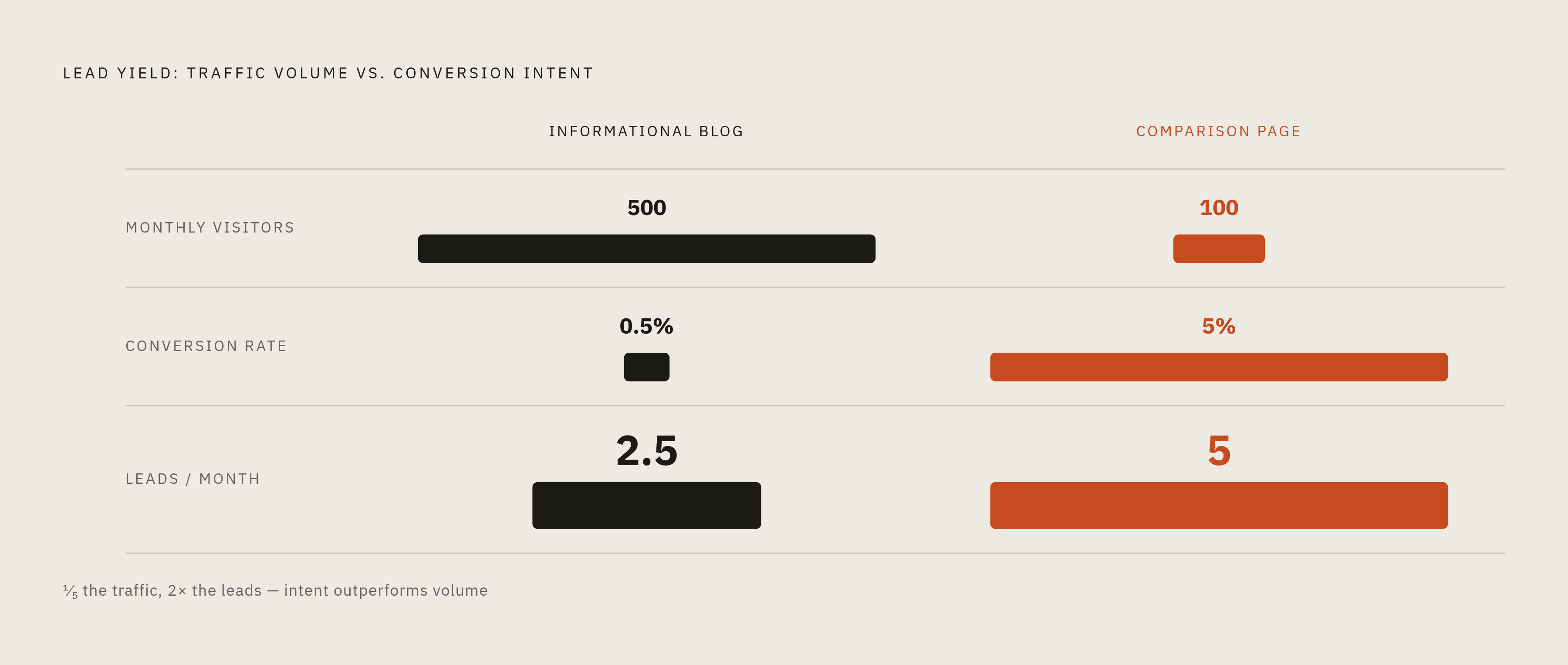
Let's do the math, because the math is the whole argument.
A typical informational blog post brings in 500 monthly visitors and converts at around 0.5%. That's 2.5 leads per month. A comparison page targeting "[Competitor] alternatives" brings in 100 visitors and converts at 5%. That's 5 leads per month from one-fifth the traffic.
Same program. More output. Way fewer visitors. A comparison page is a sniper rifle where a blog post is a garden hose — both get the job done eventually, but only one hits what you're aiming at.
And the 5 leads are better. These people have already researched the category. They're comparing specific tools. Some of them are already paying a competitor and are actively looking to leave.
One B2B SaaS company built roughly 50 comparison pages that now drive between 1,000 and 2,000 organic visits monthly, converting at 5 to 10%, returning something like 172% over production cost. Across a broader portfolio of B2B SaaS accounts, pages built with competitor comparison tables and first-party survey data averaged 47% higher conversion from organic traffic compared to standard product pages. Same pages drove three times more demo requests.
I'll be honest: I'm skeptical of any single set of numbers like these applied universally. Every market is different. But the directional logic holds even if the specific percentages don't apply to your situation. A visitor on a comparison page is worth more than a visitor on a blog post. That's true whether the multiplier is two times or five times. Build accordingly.
Where the Mid-Funnel Buyer Actually Is Before They Ever Contact You
Up to 70% of the buyer journey happens in what people call the dark funnel. That's the invisible research phase where buyers evaluate vendors, read reviews, compare alternatives, and form strong opinions without ever raising their hand or filling out a form.
Here's what that means practically. By the time a buyer reaches out to you, they've already done most of the work. And according to 6sense research, the average buying cycle dropped from about 11 months to just over 10 months between 2024 and 2025. First contact with vendors moved from happening at 69% of the journey completed to 61%. Buyers are arriving at vendor conversations having consumed more on their own, not less.
81% of buyers had already picked a preferred vendor before speaking with sales. That's the uncomfortable one. It means your comparison page often has to do the work that a sales rep never gets the chance to do, because the conversation happens before anyone picks up the phone.
Buying committees complicate this further. The median B2B buying group for deals over a certain threshold now sits at over 11 people. One page can't speak to all of them the same way.
What Different Stakeholders Actually Need
- Technical evaluators want integrations, security posture, implementation complexity.
- Financial buyers want ROI, total cost of ownership, payback period.
- End users want to know this won't blow up their workflow.
Larger committees also mean longer cycles. Mid-market deals take around four months. Enterprise deals take seven. So a comparison page has to work as a long-duration nurture asset, not just a first-contact capture. It gets read multiple times by multiple people.
One audience worth calling out specifically: 58% of B2B buyers switched vendors in the past six months. The buyer who is already a customer somewhere else and actively looking to leave is one of the most valuable audiences you can reach. That buyer deserves their own page, because their emotional state and their objections are completely different from someone evaluating the category for the first time.
The Three Types of Comparison Searches and Why Each Requires a Different Page
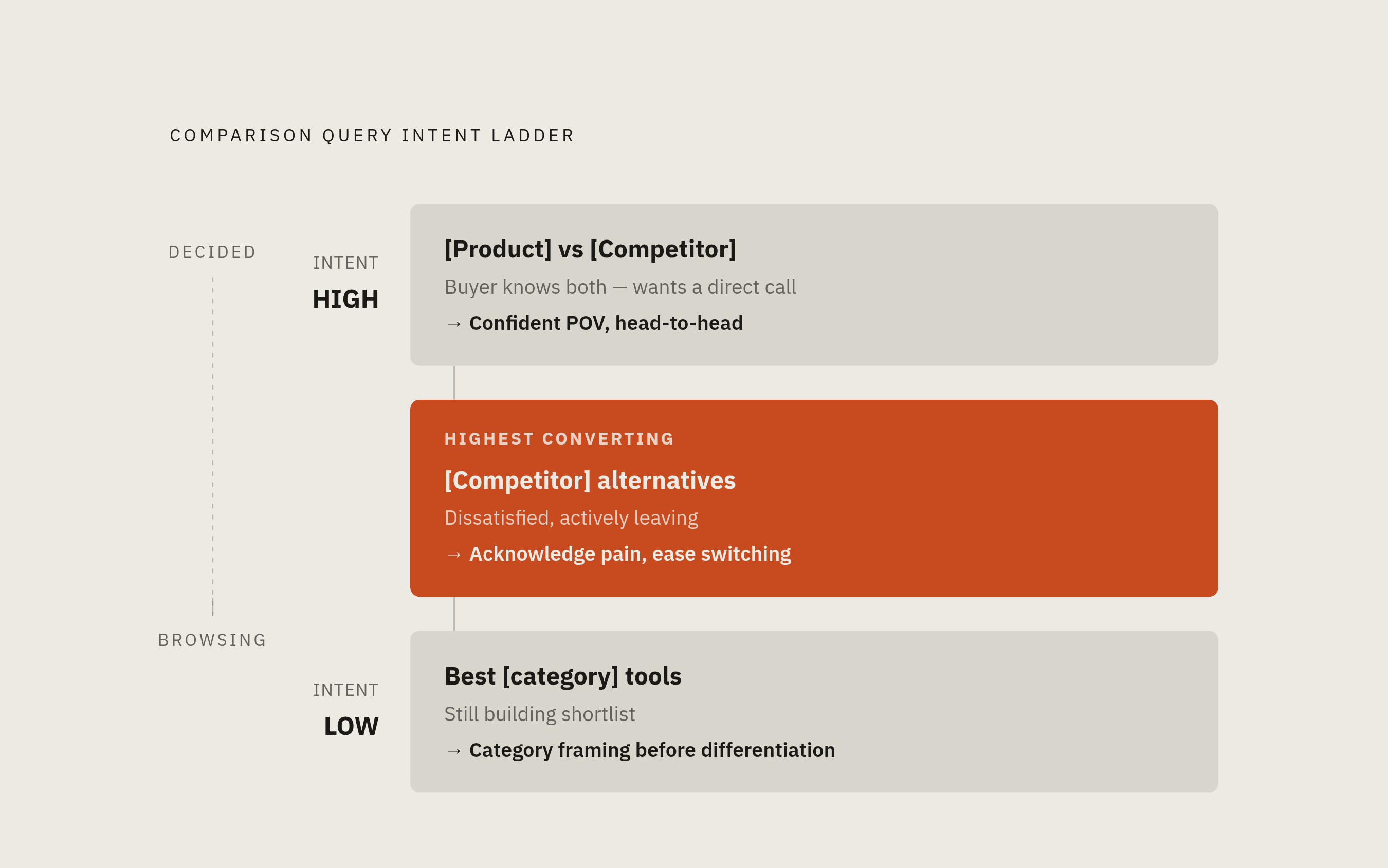
Not all comparison searches signal the same thing. Treating them identically is one of the most common mistakes in comparison page strategy, and it leaves real conversions sitting on the table.
There are three distinct query types, and each one implies a different buyer mindset and a different set of objections.
"[Your Product] vs [Competitor]"
This buyer knows both options. They want a direct call. They don't need a tour of the category. A hedged, diplomatic feature list is not what closes this buyer. A confident, specific point of view is.
"[Competitor] alternatives"
Often the highest-converting band. This buyer is dissatisfied or leaving. They have a shortlist. They've probably already decided to move on from where they are. Your page should lead with pain-point acknowledgment and make switching feel easy, not scary.
"Best [category] tools"
This buyer is still building their shortlist. They haven't narrowed down yet. They need category framing and proof of fit before they're ready for direct comparison. The page has to earn their consideration before it can differentiate.
Same template applied to all three fails all three. Accounts that built multiple comparison pages for their top competitors and matched each page to the underlying intent saw close to three times the organic growth in evaluation-stage traffic compared to accounts that templated everything the same.
One practical constraint worth stating plainly: don't build comparison pages speculatively for competitors who drive low branded search volume. No traffic means nothing to convert.
What a High-Converting Comparison Page Actually Contains, Section by Section
The craft of a comparison page is largely SEO structure and 70% credibility engineering. The structure is table stakes. The credibility is what separates pages that convert from pages that bounce.
Here's what the page actually needs, in order.
Hero Block
Name the competitor explicitly. State your differentiation thesis in one sentence. Don't make the reader scroll to figure out what your argument is. They won't.
Differentiation Block
Anchor on one strategic angle that matches your ICP's primary pain point. Not a laundry list of every possible advantage. The one thing you win on decisively. If you try to win on everything, you end up winning on nothing.
Feature Comparison Table
Be honest where you're weaker. A table where the home team wins every single row is immediately recognized by a decision-stage reader as propaganda. One acknowledged gap builds more trust than ten unchallenged wins. These buyers are not naive. They have the competitor's site open in another tab while they're reading yours.
Switcher Testimonials
Customers who came specifically from the competitor on this page carry far more weight than generic happy-customer quotes. Name the competitor they left, if they'll allow it. That specificity earns a lot.
Persona-Specific Proof
For deals with committees of three or more, surface at least two audience-specific proof points. One for the technical evaluator. One for the financial buyer. End users often respond better to case studies with workflow detail than to any other format.
FAQ Block
Answer the questions a skeptical buyer would ask if they had 30 minutes with your best sales rep. This section also gets cited disproportionately in AI-generated answers, which matters more than most teams realize right now.
CTA
Match the call to action to the buyer's stage. "Book a demo" works well for "[Competitor] alternatives" intent. A migration guide or ROI calculator outperforms it for a buyer who's still weighing options and not quite ready to talk.
And on placement: comparison pages linked from the main nav see higher internal conversions and stronger SEO signals than pages buried in blog archives. Don't hide your best asset.
Why a Factually Stale Comparison Page Actively Loses Deals It Would Otherwise Win
Here is a specific failure mode that costs teams real pipeline and that almost nobody talks about openly.
A comparison page citing a competitor's outdated pricing, a renamed plan, or a feature gap they closed six months ago will get caught in real time. The buyer is literally looking at the competitor's site while reading yours. One stale fact doesn't just fail to help. It collapses the page's authority entirely, with exactly the reader the page was built to convert.
That's the deal-losing part. Not failure to attract someone. Failure to close someone who showed up.
Ahrefs' 2025 data shows that nearly three-quarters of top-10 ranking pages are over three years old. A well-maintained comparison page can compound age and freshness together, which is the precise combination a competitor's abandoned versus page cannot replicate.
The minimum maintenance cadence is a quarterly review. And an immediate update whenever a competitor ships a pricing change or a major feature. A visible "last reviewed on [date]" line is not just a transparency signal. It tells the reader you're accountable for every claim on the page, which is a different kind of credibility than a badge or a testimonial.
Treat comparison pages like milk, not wine — they don't get better with neglect, and a stale one will cost you the sale.
How Intent Signals Surface Which Comparison Pages to Build and When to Act on Them
Comparison pages are most powerful when paired with signals that tell you who is reading them and when. The page sets the stage. Intent data tells you when the curtain is up.
A few signal types worth understanding.
First-party signals are visits happening on your own site. A target account visiting your comparison page, then your pricing page, then a competitor's G2 profile is a pattern worth noticing. Any single visit is noise. The combination of behaviors is a signal.
Third-party signals are accounts reading "[Competitor] alternatives" content across review platforms, niche blogs, and trade communities. Several B2B data vendors aggregate this reading behavior across thousands of sources and surface it as intent data.
Review-platform signals are among the most explicit mid-funnel signals available. When a prospect is actively comparing vendors on G2 or TrustRadius, you can infer serious, immediate intent.
Companies that integrate intent data into their marketing processes increase lead conversion and reduce acquisition costs. That's well established at this point. What's less discussed is the response window. When a competitive intent signal fires, the window is hours, not days. Speed-to-lead research consistently shows the first vendor to engage an evaluating prospect wins a disproportionate share of deals.
Two signals worth treating separately from the standard intent feeds.
Contract timing. Most B2B contracts renew annually. Knowing when a competitor's contract is up lets you time outreach to land 90 days before renewal, when buyers start seriously evaluating alternatives.
Contextual signals. A new CRO in their first 90 days. A CFO mentioning "go-to-market efficiency" on an earnings call. These are among the least saturated signals available, because most teams are buying the same third-party intent data feeds instead of tracking leadership changes and public earnings commentary. Less competition for the signal means more leverage from it.
Comparison Pages in AI Search: How LLMs Pick Winners and What Your Page Needs to Get Cited
As of late 2025, more than half of B2B software buyers start their research inside an AI chatbot more often than inside Google. A page that ranks on Google's first page but never gets cited in an AI-generated answer is now invisible to more than half the buyer research in the category. That's not a trend to watch. That's a structural shift that's already happened.
So comparison pages have to win in two distinct environments now. Here's what that actually requires.
Answer-First Capsules
AI chatbots grab the first definitive sentence. Put the differentiator in sentence one, not sentence four. If your page's opening line is a vague brand statement, the model moves on.
Named-Competitor FAQ Blocks
LLMs weight Q&A blocks heavily. A block formatted as a direct question, something like "Is [Your Product] a better fit than [Competitor] for [use case]?" followed by two or three sentences answering it plainly, gets cited verbatim. This is one of the highest-leverage structural choices you can make for AI visibility right now.
Specific, Verifiable Claims
Vague positioning doesn't get quoted. Specific, verifiable differentiators do. "We're easier to use" is not citable. "Users report onboarding in under a day, versus a multi-week implementation" is a claim a model can actually quote.
G2's 2025 research found that 45% of buyers say review-site citations are the single most confidence-inspiring signal in an AI-generated answer. That means your G2, TrustRadius, and Capterra presence feeds directly into LLM citation behavior. Badge placement on your comparison page matters beyond just trust signals. It signals to models that your claims have third-party verification behind them.
One more distribution channel that's earning a real place in comparison-page strategy. A study of over 4,500 comparison-query search results found Reddit threads appearing in a meaningful share of results, rising substantially in the most competitive categories. Communities like r/SaaS are now part of how comparison content gets distributed and discovered. That's not a distraction from SEO. It's an extension of it.
In a world where most informational searches now end without a click to an external site, being the source that gets quoted inside the AI answer matters as much as being the destination that earns the click.
Activating Comparison Pages Across the Sales Motion: From Content Asset to Closed Deal
A comparison page that lives only as an SEO asset misses most of its value. This is the part that gets skipped most often, because it requires coordination between content and sales, and that coordination is genuinely annoying to set up.
But think about what a well-built comparison page actually is. It's a structured, credible, third-party-validated argument for why your product wins a specific decision against a specific competitor. That's not just useful for a buyer who Googled their way to it. That's useful at every stage of the sales motion.
Here's how high-performing revenue teams actually use them.
In outbound sequences. When intent signals show a prospect is actively researching a competitor, a comparison page becomes a relevant, non-pushy first touch. "I saw you've been looking at [Competitor]. We built something specifically for teams in your situation" is a much warmer open than a cold capability pitch.
In discovery calls. When a prospect mentions they're also evaluating a specific competitor, a rep can drop the comparison page as a follow-up. It does the differentiation work in writing, so the rep doesn't have to spend 20 minutes on a feature matrix during the call.
In multi-stakeholder deals. The technical evaluator forwarded the page to the CFO. The CFO reads the persona-specific ROI section. This is how comparison pages earn their keep in longer enterprise cycles. They travel inside the buying committee in ways your sales team simply can't.
In competitive deal stages. When a deal is stalled and the prospect is going quiet, a comparison page shared with new context ("we just updated this with Q3 pricing data and two new case studies from [Competitor] switchers") creates a legitimate reason to re-engage without being annoying about it.
In sales enablement libraries. Reps who know exactly which comparison page to use for which competitor close competitive deals faster. That's not a theory. It's a practical outcome of making the asset easy to find and actually use.
The comparison page is not a set-it-and-forget-it SEO play. It's a live sales tool. Build it that way, maintain it that way, and deploy it across the full revenue motion. That's how it earns its conversion premium.